

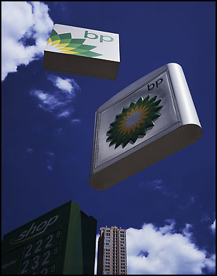
Matt Silber's Floating Logos is inspired by signs perched high atop very tall poles in order for people to view them from a long distance away. Often these poles are so tall that the signs on top of them loom over us, ominously broadcasting their message. The digital elimination of the poles not only illustrates this effect further but also serves to disconnect the signs from the ground and reality. Often the ground is purposefully left
out of these images in order to emphasize the disconnect, but hints of terra firma are included in the form of trees, wires, light poles, buildings and other land-based objects.
As a device to point out, or draw attention to, this common phenomenon in our landscape, the removal of the poles also adds some conceptual layers. As floating sculptures in the sky, the images could allude to religion, spirituality, the supernatural, or even the popular science fiction concept of superior extraterrestrials. The mysteriousness of these concepts furthers the idea that these signs represent something that is just beyond our control and understanding yet affects us in significant and important ways.
see more images here:
http://www.siberart.com/home%20pages/home.html
AKI COMMENT:
Funny how simply removing the poles of megabrand signage introduces a bit of surreality, humor and religious allusion. Our mundane branded landscape becomes hauntingly creepy thru this lens effect.
Wednesday, January 11, 2006
Commentary: Floating Logos Project
Subscribe to:
Post Comments (Atom)


No comments:
Post a Comment