We've posted before about a delightful trend of graphic artists and engineers and programmers re-mapping our information world in engaging graphical forms here, here
and here.
Some updates this week: 
Map of global takeover of McDs and Starbucks, analysis of the world's transportation methods, waterworlds , arms around the world, government red tape.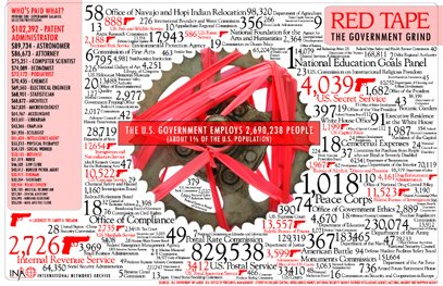

News stories are highlighted at Mapped Up, and a balloon appears with a headline; clicking on the balloon sends you to the source of the story. 
Newsmap is an impressive news headline visualization software. The visualization includes horizontal, color coded bands for categories and larger font sizes to indicate the number of related stories. This treatment not only illustrates the hottest topics of the moment, it also reveals underlying patterns in news reporting.
Saturday, August 26, 2006
Trend: Information Aesthestics Update
Subscribe to:
Post Comments (Atom)


No comments:
Post a Comment