Share ideas that inspire. FALLON PLANNERS (and co-conspirators) are freely invited to post trends, commentary, obscure ephemera and insightful rants regarding the experience of branding.

Showing posts with label Information Aesthetics. Show all posts

Thursday, July 24, 2008

Visualization of Information: PicLens, Digg Labs and Twitter/Flickrvision

Here are three applications that allow you to search visually news, status updates, videos, pictures etc. in cool new ways.

PicLens lets you search for photos and videos in 3-D and in full screen. This web browser add-on makes it way easier to search for things with out paging through a website and its also makes it much more fun. Its like apple's coverflow to another dimension. Once you download the add-on a blue box in the upper right corner will light up when a page is viewable with PicLens.


Digg labs web applications organize all the news items on Digg visually. With Digg Stack, the stories are bar graphs that get taller given the amount of Diggs, so you can watch stories grow. Digg Swarm creates circles around stories that get bigger as they are dugg. All of these applications can be accessed online or used as a screensaver.
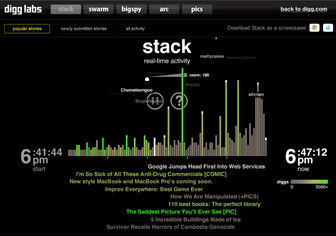
stack


Twittervision and Flickrvision allow you to see what people are seeing and saying in real time around the world. Using google maps or a 3-D map this program shows you exactly where tweets and photos are coming from. It can get addicting. You can view it on a browser or download the screensaver. They also have a local version that only shows what is going on in your specific area. There is no way I know of to see only my friends on the map and have multiple tweets or photos up at a time. I imagine these programs will get cooler and developed as GPS is becoming more common in cell phones.
flickrvision

Friday, October 26, 2007

Makes You Think.

"Interesting Snippets" is a flickr site for Lynette Webb, a Senior Strategic Insights Manager at Google UK (previously incorrectly described (by me) as Director of Futures). In her own words, it's "my personal dumping ground for various cool quotes, the odd stat, as slides to talk around when describing how things are changing online and in media & communications generally."

It's essentially a blog that is headlined with an interesting picture and quote (often from a blog, article or speech). I would love to ask which usually comes first: inspiration from a photo, the stat or a broad idea that she finds can be articulated in one of the first two.


Sunday, June 24, 2007

Blog DNA


WEB2DNA converts your website into a DNA graphic image. It was inspired by DNA 11 - a company that turns your real DNA into works of art, and, Marcel Salathe's Websites as Graphs - another system that visualizes your website structure.

Friday, May 18, 2007

Shift Happens:Aggregators for your Aggregators


I now subscribe to 226 RSS Feeds (I have to segment my reading by topic groups each day to get thru 'em by the end of the week-which still puts me behind on 80% of my info). Now with old school email (work and personal), Blackberry, a few social networks (Plannersphere, LinkdIn, Facebook), blogging, micro-blogging (Twitter, Tumblr, Meshly), instant messaging, TV/DVR, morning magazines in the bathroom, Second Life, face-to-face meetings and even the impromptu lo-fi human conversation at the watercooler, I have a damn pressing need for aggregators of my aggregators. The future is info management genies!

Uberblogger Robert Scoble is truly one-of-a-kind. For those who don’t know, he became famous as a technical evangelist at Microsoft and quickly became their most outspoken and influential blogger. He now interviews people like Bill Gates, and the worldwide media reports on his every move. One of his most mindboggling skills is information management. He currently reads 622 RSS feeds a day — it used to be 1,400 feeds a day!

He expains his process:


via fourhourworkweek

Thursday, May 03, 2007

State of the Blogosphere/Live Web:Maps


Nielsen's Matthew Hurts recently drafted a graphic map showing the blogosphere in links. This picture is based on an examination of six weeks of blogosphere data.

Each little white dot represents a blog. The bigger white dots represent blogs with more incoming and outgoing links, while the smaller dots are blogs with fewer links.

The green lines represent one-way links from one blog to another, and the blue lines show reciprocal links, or blogs that link back and forth to one another regularly.

-The biggest white dots are popular blogs like Boing Boing and the Daily Koz.
-That isolated streak of green in the upper right hand (by the number three) shows LiveJournal blogs. LiveJournal users tend to link heavily to other LiveJournal blogs, but don't communicate as frequently with the outside world.
-The blue spots show bloggers who frequently link back and forth, possibly writing responses on their own blogs to items they've read on other sites and vice versa.
-Number 5 shows the fringe community of bloggers who share pornographic images and write about adult industry news and gossip.
-Number 6 sports enthusiasts who are a bit more linked into the rest of the mainstream blogosphere than the pornography enthusiasts or LiveJournal bloggers. But it's still a distinct community with users communicating primarily amongst themselves.

Similarly, here is Brian Shaler's Map of the Digg Universe


And Opte Project's massive Map of the Internet and animation.