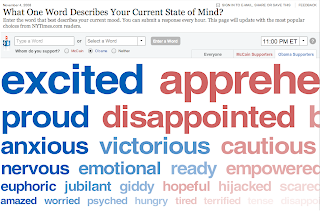
On the day Barack Obama was elected President, the New York Times introduced an interactive poll they called the “Word Train.” It asked one simple question: What one word describes your current state of mind? Readers could enter an adjective or select from a menu of options. They could specify whether they supported McCain or Obama. The results appeared in six rows of adjectives, scrolling left to right, coded red or blue, and descending in font size. The larger the word, the more people felt that way. Throughout the entire day a river of emotions flowed through the chart. You could click from Obama to McCain and watch the letters shift gradually from blue to red, the mood change from energized, proud, and overwhelmed to horrified, ambivalent, disgusted, and numb.
http://www.nytimes.com/interactive/2008/11/04/us/politics/20081104_ELECTION_WORDTRAIN.html?scp=1&sq=what%20one%20word%20describes&st=cse
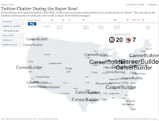
Recently, the New York Times created another interactive feature that harvested all Twitter chatter surrounding the Super Bowl. By pressing play on this graph, the reader is able to watch the location and frequency of commonly used words during the Super Bowl. In all, there are six different categories to choose from including, “Talking about Ads.”
http://www.nytimes.com/interactive/2009/02/02/sports/20090202_superbowl_twitter.html
These features have proven to pull readers closer through comments and interactivity, rendering the relationship between reporter and audience more intimate, immediate, and exposed. Of the massive 20 million unique visitors per month compared with the daily print edition’s readership of 2.8 million, the readers are flocking to these interactive features. As Jonathan Landman, deputy managing editor puts it, “We’re trying very hard to protect it [the interactive features], because that’s where the action is.”
For an advertising or marketing agency the implications for these interactive maps/graphs are big. The ability to get real-time answers about our products or services has existed for sometime now; think twitter, online forums, live chat…but not in this way. These interactive graphs create an entertainment value and coolness factor for the user while generating a visually appealing way to aggregate all their messages, emotions, or displeasure's about a brand, product, or service and communicate it back to the client in a simple way.
Here are links to some others:
http://www.nytimes.com/interactive/2009/02/02/business/media/20090202-business-superbowlads.html
http://www.nytimes.com/interactive/2008/08/04/sports/olympics/20080804_MEDALCOUNT_MAP.html?scp=6&sq=interactive&st=cse
And the link to the article about the people who create these graphs:
http://nymag.com/news/features/all-new/53344/index1.html
Share ideas that inspire. FALLON PLANNERS (and co-conspirators) are freely invited to post trends, commentary, obscure ephemera and insightful rants regarding the experience of branding.
Saturday, February 07, 2009
New York Times' Interactive Graphs
Posted by
Aaron E.
at
2/07/2009 02:18:00 PM
![]()
Labels: aaroneicher, Election 08, graphs, Interactive, NYTimes, SuperBowl
Subscribe to:
Post Comments (Atom)

2 comments:
Excellent article. It's a really interesting post. I appreciate the author for this helpful post. Visit our website
sathya online shopping
online ac showrooms
buy inverter ac online
buy split ac online
buy window ac online
buy air cooler online
pg ทดลอง เล่น ฟรี ซื้อ ฟรี สปิน พร้อมที่จะลุ้นโชคด้วยการเล่นด้วยจริงคุณสามารถซื้อฟรีสปิน เพื่อเพิ่มโอกาสในการชนะ! ทดลอง PG ที่เว็บไซต์ของเราและค้นพบความสนุกที่ไม่มีที่สิ้นสุด!
Post a Comment