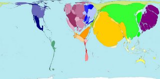
Map the world on your terms. Visualizing readily available data is becoming more democratized. Once, access to this type of tool was limited to elite think tanks, governments or wealthy corporate subscribers. This type of information has huge potential for expanding the average person's understanding of our planet. That seems like a good thing. This is a map of rail passenger traffic by country. Countries are scaled. For those critical of mass-transit development in the U.S., check out South American and Africa. Small comfort perhaps. Sites worth checking out:
http://www.nationmaster.com/, http://maps.maplecroft.com/, http://www.sasi.group.shef.ac.uk/worldmapper/index.html
Also regularly visit http://www.infosthetics.com. Often fascinating examples of new forms of data visualization.
Share ideas that inspire. FALLON PLANNERS (and co-conspirators) are freely invited to post trends, commentary, obscure ephemera and insightful rants regarding the experience of branding.
Thursday, April 06, 2006
Trend: Information Aesthetics
Subscribe to:
Post Comments (Atom)


1 comment:
fresh sites. fresh graphs, too.
Post a Comment